by Jonathon Hyjek | Nov 14, 2022 | Website Design

If you’ve ever watched the popular television show, “Kitchen Nightmares” chances are you’re familiar with Gordon Ramsay and his colourful kitchen commentary. A world-class chef, Ramsay spends a great deal of his time trying to help failing restaurants bounce back from the brink of disaster. And while Ramsay’s potty mouth may be out of line at times, his advice is normally spot on.
In fact, after watching a few episodes, Chris Dugas, ZOO’s Partner & Managing Director couldn’t help but draw a few parallels between running a successful restaurant and designing a top-notch website. “Think whatever you want of Mr. Ramsay,” says Dugas with a smile, “but a lot of what he says in his abrasive and caustic manner can be used to improve your online presence.”
So, what are you waiting for? Let’s get cooking!
Tip #1 – Clean Up Your Menu
Extended restaurant menus are confusing. When owners try to put up as much food as possible, chances are none of it tastes very good. Too much variety can be a bad decision, both in the kitchen and on the web.
Too many websites these days are overflowing with information. So much information that it makes finding what you’re looking for next to impossible! Too much varied or abstract content won’t help your site, so take a tip from the restaurant business and streamline your navigation menu and website content. Focus on the really important areas of your business, the things that your customers are likely to be looking for when they hit your website. Your conversion rates will increase, as will your search engine rankings.
Tip #2 – Redecorate
Bad restaurant decor is the kiss of death. A clean, well thought-out dining room can make a world of difference in a failing restaurant because it elevates the eatery’s status with customers and helps them feast with their eyes first!
The same goes for a badly designed website. Some website designs can look clunky. Cleaning up your design will make your site more appealing to visitors and help you change the perception of your brand.
Tips #3 – Prepare Food Your Guests Want to Eat
Most restaurant owners are stubborn. They believe that they know exactly what their customers want, even when their customers tell them they’re wrong! Restaurants that are struggling to fill tables are often suffering because their owners refuse to accept feedback and make a change.
This stubbornness is even more apparent with some website designers. Some website designers will put whatever they want on a website, even if it has the potential to send visitors away. Just because a feature is “revolutionary” or “exciting” doesn’t mean that it will benefit your visitors. Remember, it’s not your website, it’s the visitor’s site. Park your ego at the door. Add features that will help improve their experience.
Tip #4 – Don’t Cut Corners
Diners can always tell if a restaurant uses quality ingredients. The food just looks, smells, and tastes better. Restaurants that aim high and strive to maintain the highest standards succeed – plain and simple.
Cutting corners on your website can have fatal results. So don’t cheap out! Investing in a quality website design now will benefit your business for many years to come. What you put into your website will come out of it. Make sure you’re putting in the best ingredients.
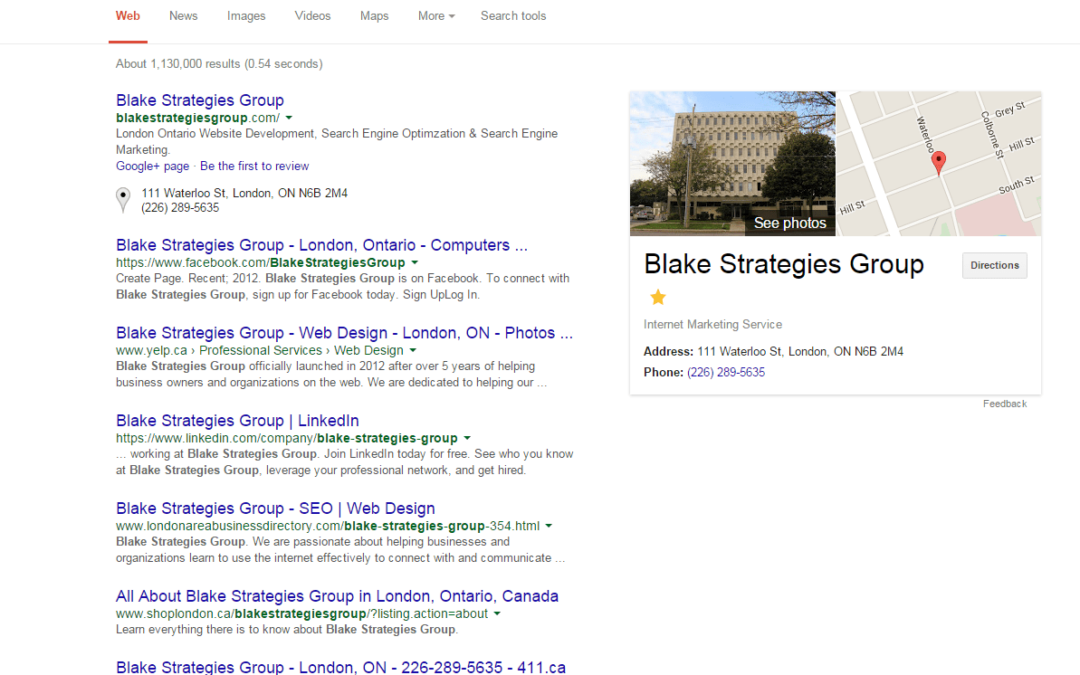
If you can’t take the heat, then get out of the kitchen! Or better yet, give the London Ontario website design experts at Blake Strategies Group or ZOO Media Group a call. ZOO’s mouth watering website designs are sure to be a big hit with your online customers and will keep them coming back for more!
by Jonathon Hyjek | Jul 23, 2012 | Website Design
There seems to be an ever-increasing trend toward everyone thinking that they are an expert and wanting to build their own website to save a few dollars. While I do agree that some website designers charge far too much for their services, many times in an effort to cover their high overheard, I don’t believe that most business owners have the time, skill, patience or artistic eye to build a website that will represent their business professionally.
About 10 years ago I bought a cheap, new car that didn’t have a good reputation for their quality. After only a few years of driving it, the paint started to peel off of the bumper. I hated the look for the peeling paint, but didn’t have the money to take it to a body shop and have it repaired professionally. It was going to cost likely $200-$300 to fix and times were tough.
I decided to Google how to fix these blemishes and I found lots of information. The next step was to visit my local Canadian Tire store and look at the auto body section. I picked up some supplies and spray paint that matched the paint on my car and went home to give it a try. It was a nice sunny day, so I just worked in my driveway because I didn’t have a garage to pull the car into. I figured that it wasn’t very windy outside, so it wouldn’t matter. After a few hours of spraying and sanding and spraying some more I was done. Guess what? It looked TERRIBLE. I’m not sure if the new paint job or the previous peeling problem was worse.
I was disheartened by my little adventure into the auto body business, but it didn’t end there. A year or two later I needed to trade that car in for something else. As they were going over the car, determining the trade-in value, they noted my awful work and said that it would have to be repainted professionally. They knocked a few hundred dollars off the value to cover the repairs.
The moral of the story…
Don’t pretend you know how to do everything. If you need to call in a professional, do it!
When it comes to websites, it could be one of your most important assets. Long before a person calls you to inquire about your services or walks into your retail store, they’re going to visit your website. If your website is poor quality, it reflects on your business. Don’t just think that “it’s good enough.” That kind of attitude isn’t helpful, especially in our very web-savvy world. Customers and prospective customers will judge your company by the quality of the website and if it doesn’t look professional, those customers may never call or visit.
Is it worth losing out on potential customers, just to save a little money?
Free website builders have a number of flaws.
1. Free website builders usually have about 10 templates that you can use, so chances are good that there are an awful lot of websites out there that look exactly like yours.
2. With a completely free website builder, you don’t get your own domain name. Nothing says “cheap” like having to go to a website address that has a URL like mybusiness.yolasite.com or mybusiness.webs.com. Every customer that visits is going to know you didn’t invest anything into your website.
3. Don’t pretend that you can do everything. I know I can’t! I can’t fix my car and I won’t even attempt it. I take it to a local mechanic who charges $80 per hour. It’s a lot of money, but I know it gets done right. If you don’t have an eye for details or you aren’t a great website content writer, don’t try to be. Let someone else do that.
4. Free website builders have a lot of limitations. You basically take what they give you. If you’ve got an idea, a unique way to use your website or whatever, it’s not going to happen using a free website builder.
As an individual that builds websites for very small businesses, I am quite aware that money can be a big problem for most small businesses. That’s why for my clients, I prefer to be flexible with payment plans and try to give them a good deal, before I recommend going to a free website builder. I just hate seeing people try to struggle through building their own website when we could just work something out.
by Jonathon Hyjek | Jul 8, 2012 | Online Marketing
When websites were first introduced, it was revolutionary. No longer did a business need to get a paper brochure into the hands of your prospective customers. The business owner simply pointed their prospects to their website address and the customer could get information about the company right from their company website. For the first 5 years or more, this was amazing and worked fairly well. We all thought this new method of marketing was amazing.
That was then…
This would be a good news story for most businesses, if it wasn’t for the fact that many businesses are still using early 90’s online marketing methods.
What do I mean by that?
Here’s the typical scenario. Businesses approach a web designer to build a website that includes the standard stuff; A contact page, a page that details their services, a bio page and maybe a few other random pages or a portfolio. The website goes up and the business owner expects big things to happen, only to be disappointed by a lack of interest in their website.
So what’s the problem?

The problem is that much has changed in the marketing world and in society in general. We have become a highly interactive society, very attached to technology and we expect businesses that we interact with to be at the forefront of our tech savvy, interactive world. Visitors to your website no longer want to visit a boring website that just tells what products or services your offer. They are looking for a website that gives them up-to-date, valuable information. They want to interact and connect with the business, have their questions answered, have their fears or concerns addressed and they want to know that you are the best company or service provider for them to do business with.
This requires a change in the way that websites are built. It requires businesses to seek out companies that can do more than just built a website. Businesses need to work with an online marketing company that they trust and one that they can build a long-term relationship with.
If you require help with your online marketing strategy, contact us for more information on how we can help.It’s not good enough to toss up a website and wait for results and it’s not a one-sided conversation anymore.
by Jonathon Hyjek | Jul 5, 2012 | Online Marketing
Why is it that we’re willing to pay for quality products or services in some aspects of our life, but not all?
Sometimes it comes down to budget and we just don’t have the money for what we want, so we look for the least expensive option, but in other areas we don’t mind paying for better quality because we realize that we’re getting a vastly different product or service.
Here’s what I mean:
When you want your car fixed, you have the option to take your brand new Mercedes-Benz to the dealer at a cost of over $100/hr, or you can opt for the less expensive local mechanic that may charge $65 or $75 per hour. Chances are good that even though the first option is more money, you will choose it because you know that the Mercedes dealer will do the job correctly. They know your car and they have the genuine parts that it will need.
Another example of cheaper vs. better is when you set out to buy a new pair of shoes. You can go to Wal-Mart and buy just about any style of shoes you might ever want at less than $50. So why is it that you don’t mind paying $150 for a pair of Clarke’s or Rockports? It’s because there’s a difference in quality which you don’t mind paying for.
Now let’s bring this concept into the world of SEO, websites and online marketing. There are all kinds of people offering a website for prices from $100 to $10,000. There are “SEO experts” that offer their services for $10/hr while others charge $250/hr. If you’re a bargain-hunter, you may be drawn to the $100 option and you decide it’s best solely based on the low price. The trouble with doing this, just like the car dealer or your new shoes is that there’s a good chance you’re not getting the same thing. You’re not comparing apples to apples.
Price can only be one of many considerations when choosing an SEO company or website designer. It shouldn’t be the only criteria or you risk getting something that’s vastly different than what you actually need.
Cheaper rarely equals better…
by Jonathon Hyjek | Jun 1, 2012 | Website Design
Why Website Glitches and Errors Ruin First Impressions
In retail, it’s well-known that customers form a first impression in as little as 7 seconds. Stores invest heavily in lighting, fixtures, and staff training to ensure that initial moment is positive.
Online, your website is your digital storefront, and those 7 seconds are even more critical. Before potential customers notice your design or branding, they’re likely to spot glitches, broken images, outdated content, security warnings, or error messages—issues that scream unprofessionalism and drive visitors away.
When someone Googles your business and lands on your website, technical flaws can overshadow even the most polished design. A broken link, a “404 Not Found” error, or a security alert can make users question your credibility and leave within seconds. In 2025, with users expecting seamless digital experiences, these issues are dealbreakers.
This guide explores why technical reliability is crucial for making a great first impression, the specific issues that hurt user experience, and how to partner with the right team to keep your website running smoothly.
Why Technical Issues Trump Design in First Impressions
A 2024 study found that 88% of users won’t return to a website after a bad experience, and technical issues are often the culprit. Unlike design, which requires a moment to process, problems like broken images or error messages are immediately noticeable and frustrating.
Consider these stats:
- 53% of mobile users abandon a site that takes over 3 seconds to load.
- 38% of visitors stop engaging if content or functionality is broken.
- 70% of consumers say a site’s performance influences their perception of a brand’s reliability.
Your website is your 24/7 representative. If it’s plagued by technical issues, it’s like having a store with flickering lights, locked doors, or rude staff—customers won’t stick around. Let’s break down the key technical issues that ruin first impressions.
Technical Issues That Drive Users Away
1. Broken Images and Links
Nothing says “neglected website” like a broken image (the dreaded “missing image” icon) or a link that leads to a 404 error page. These issues disrupt the user journey and erode trust.
- Impact: A broken product image on an e-commerce site can halt a purchase, while a dead link frustrates users searching for information.
- Fix: Regularly audit your site for broken links and missing images using tools like Screaming Frog or Google Search Console.
Pro Tip: Our website design services include ongoing maintenance to ensure all links and images work flawlessly.
2. Outdated Content
Content that’s irrelevant or stale—think old promotions, expired event listings, or outdated product details—makes your business look out of touch.
- Impact: Users may assume your business is inactive or unreliable. For example, a “2023 Sale” banner in 2025 signals neglect.
- Fix: Implement a content review schedule to keep information current. Use a CMS like WordPress for easy updates.
3. Security Issues
Security warnings, such as “Not Secure” alerts in browsers or missing SSL certificates, scare users away. In 2025, 85% of consumers prioritize website security when deciding to engage with a business.
- Impact: A security warning can make users question your legitimacy, especially for e-commerce or service-based sites handling sensitive data.
- Fix: Ensure your site uses HTTPS, update software regularly, and use secure hosting. Display trust badges (e.g., SSL, BBB) to reassure visitors.
Pro Tip: Learn more about our approach to secure, reliable websites on our Website Management page.
4. PHP and Server Errors
Technical errors like “500 Internal Server Error” or PHP warnings (e.g., “undefined variable”) are immediate red flags. These often stem from outdated code, incompatible plugins, or server issues.
- Impact: Errors disrupt functionality, such as contact forms or checkouts, leading to lost leads or sales.
- Fix: Work with developers who use modern frameworks, test code thoroughly, and maintain server health. Regular updates to PHP (e.g., version 8.2 or higher in 2025) are critical.
5. Slow Load Times
A slow website is a conversion killer. Google’s 2025 Core Web Vitals emphasize speed, with a target load time of under 2.5 seconds for optimal user experience.
- Impact: Slow pages frustrate users and hurt SEO rankings, as Google penalizes sluggish sites.
- Fix: Optimize images, use a content delivery network (CDN), and choose fast, reliable hosting.
6. Mobile Incompatibility
With 60% of web traffic coming from mobile devices, a site that’s not mobile-friendly is a major liability. Glitches like misaligned elements or unresponsive buttons are glaring on smaller screens.
- Impact: Mobile users will bounce if navigation is clunky or content doesn’t display correctly.
- Fix: Adopt responsive design and test your site on multiple devices using tools like Google’s Mobile-Friendly Test.
The Consequences of Technical Issues
Technical problems don’t just annoy users—they have tangible business impacts:
- Lost Revenue: A broken checkout process can cost an e-commerce site thousands in abandoned carts.
- Damaged Reputation: Error-prone sites make your business look unprofessional or unreliable.
- SEO Penalties: Google’s algorithms prioritize user experience. Slow load times, broken links, or mobile issues can tank your rankings.
- Higher Bounce Rates: A 2024 study found that sites with technical issues have bounce rates as high as 70%.
Why Cheap Web Development Backfires
Hiring the cheapest developer might save money upfront, but it often leads to a site riddled with glitches, outdated code, or security vulnerabilities. A developer who focuses solely on technical setup without prioritizing user experience or ongoing maintenance can cost you more in lost customers and emergency fixes.
Instead, partner with a team that:
- Tests for functionality across browsers and devices.
- Prioritizes security with HTTPS and regular updates.
- Monitors for errors and maintains up-to-date codebases.
- Understands SEO to ensure technical issues don’t harm rankings.
At Blake Strategies Group, we build reliable, user-focused websites that minimize technical issues and maximize conversions.
Technical Best Practices for 2025
To ensure your website makes a flawless first impression, adopt these practices:
- Regular Audits: Use tools like GTmetrix or Lighthouse to check for broken links, slow load times, and mobile issues monthly.
- Update Software: Keep CMS platforms, plugins, and PHP versions current to avoid errors and security risks.
- Secure Hosting: Choose a provider with robust security and uptime guarantees.
- Error Monitoring: Implement tools like Sentry to catch PHP or JavaScript errors in real-time.
- Accessibility Compliance: Follow WCAG guidelines to ensure your site is usable for all visitors, including those with disabilities.
Conclusion
In 2025, your website is your business’s first handshake with potential customers. Technical issues like broken images, outdated content, security warnings, PHP errors, or slow load times can ruin that critical 7-second first impression, driving users to competitors. A reliable, error-free website builds trust, boosts conversions, and supports long-term growth.
Don’t cut corners with a cheap developer who overlooks technical reliability. Invest in a website that performs as well as it looks. Ready to create a glitch-free online presence? Contact us at Blake Strategies Group to build a website that delivers seamless user experiences.
For more tips on optimizing your digital presence, check out our blog for insights on SEO, marketing, and web development.